mirror of https://github.com/rust-lang/rust.git
rustdoc: show crate name beside smaller logo *Blocked on https://github.com/rust-lang/cargo/pull/12800* ## Summary In this PR, the crate name and version are always shown in the sidebar, even in subpages, and the lateral navigation is always shown in the sidebar, even in modules. Clicking the crate name does the same thing clicking the logo always did: take you to the crate root (the crate's home page, at least within Rustdoc). The Rust logo is also no longer shown by default for non-Rust docs. ### Screenshots <details><summary>Before</summary> | | Macro | Module | |--|-------|--------| | In crate | 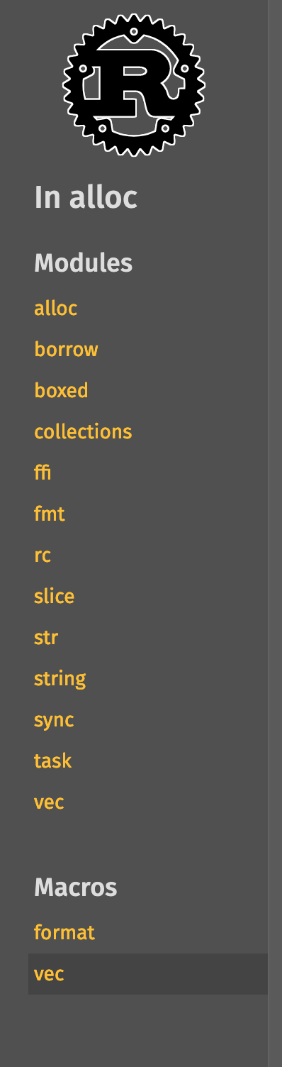 |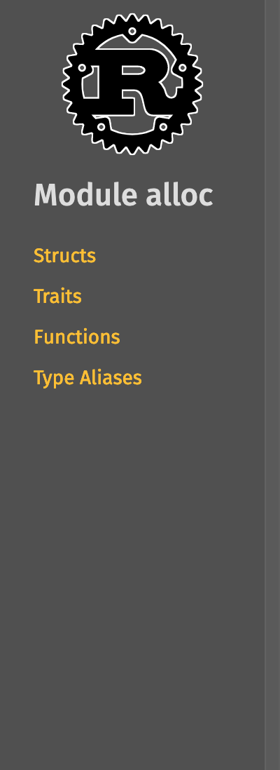 | In module[^1] | 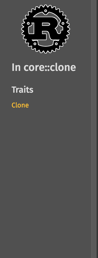 |  [^1]: This PR also includes a bug fix for derive macros not showing up in the lateral navigation part of the sidebar </details> #### Whole sidebar screenshots | | Macro | Module | |--|-------|--------| | In crate | 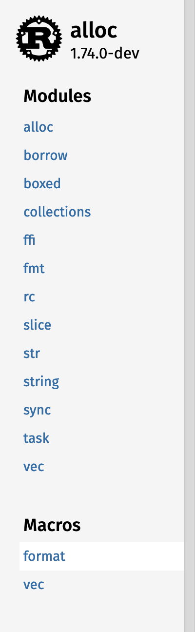 |  | In module | 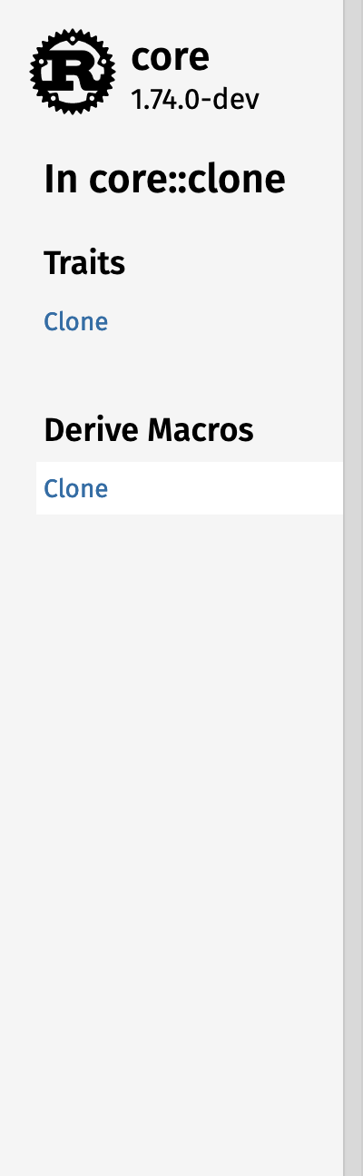 |  #### Different logo configurations | | Short crate name | Long crate name | |---------|------------------|-----------------| | Root | ![short-root] | ![long-root] | Subpage | ![short-subpage] | ![long-subpage] [short-root]: https://github.com/rust-lang/rust/assets/1593513/9e2b4fa8-f581-4106-b562-1e0372c13f79 [short-subpage]: https://github.com/rust-lang/rust/assets/1593513/8331cdb8-fa13-4671-a1e2-dcc1cdca7451 [long-root]: https://github.com/rust-lang/rust/assets/1593513/7d377fec-0f1d-4343-9f82-0e35a8f58056 [long-subpage]: https://github.com/rust-lang/rust/assets/1593513/3b3094a4-63c9-477c-8c15-b6075837df30 ##### Without a logo  ### Preview pages https://notriddle.com/rustdoc-html-demo-5/sidebar-layout-rocket/rocket/index.html https://notriddle.com/rustdoc-html-demo-5/sidebar-layout-rocket/rocket_sync_db_pools/index.html https://notriddle.com/rustdoc-html-demo-5/sidebar-layout-rust-compiler/index.html https://notriddle.com/rustdoc-html-demo-5/sidebar-layout-rust/std/index.html https://notriddle.com/rustdoc-html-demo-5/sidebar-layout-rocket/tokio/index.html ## Motivation This improves visual information density (the construct with the logo and crate name is *shorter* than the logo on its own, because it's not square) and navigation clarity (we can now see what clicking the Rust logo does, specifically). Compare this with the layout at [Phoenix's Hexdocs] (which is what this proposal is closely based on), the old proposal on [Internals Discourse] (which always says "Rust standard library" in the sidebar, but doesn't do the side-by-side layout). [Phoenix's Hexdocs]: https://hexdocs.pm/phoenix/1.7.7/overview.html [Internals Discourse]: https://internals.rust-lang.org/t/poc-of-a-new-design-for-the-generated-rustdoc/11018 ## Guide-level explanation This PR cleans up some of the sidebar navigation. It makes the logo in the desktop sidebar a bit smaller, and puts the crate name and version next to it (either beside it, or below it, depending on if there's space), making it clearer what clicking on it does: click the crate name to open the crate's home page. It also removes the Rust logo from non-official-Rust crates, again to make the navigation and supply chain clearer (since the crate name has been added, the logo is no longer necessary for navigation). It adds a bit more clarifying information for lateral navigation. On items that don't add their own sidebar items, it just shows its siblings directly below the crate name and logo, but for other items, it shows "In crate alloc" instead of just "In alloc". It also shows the lateral navigation tools on module pages, making modules consistent with every other item. ## Drawbacks While this actually takes up less screen real estate than the old layout on desktop, it takes up more HTML. It's also a bit more visually complex. ## Rationale and alternatives I could do what the Internals POC did and keep the vertically stacked layout all the time, instead of doing a horizontal stack where possible. It would take up more screen real estate, though. ## Prior art This design is lifted almost verbatim from Hexdocs. It seems to work for them. [`opentelemetry_process_propagator`], for example, has a long application name. [`opentelemetry_process_propagator`]: https://hexdocs.pm/opentelemetry_process_propagator/OpentelemetryProcessPropagator.html ## Unresolved questions Maybe we should encourage crate authors to include their own logo more often? It certainly helps give people a better sense of "place." This seems to be blocked on coming up with an API to do it without requiring them to host the file somewhere. ## Future possibilities Beyond this, plenty of other changes could be made to improve the layout, like * Fix things so that clicking an item in the sidebar doesn't cause it to scroll back to the top. * The [Internals demo](https://utherii.github.io/new.html) does this right: clicking an item in the sidebar changes the content area, but the sidebar itself does not change. This is nice, because clicking is cheap and I can skim the opening few paragraphs while browsing. * The layout of the docs sidebar causes trouble to implement this, because it's different on different pages, but at least fix this on the file browser. * Come up with a less cluttered way to do disclosure. There's a lot of `[-]` on the page. * We don't lack ideas to fix this one. We have *too many*. * Do a better job of separating local navigation (vec::Vec links to vec::IntoIter) and the table of contents (vec::Vec links to vec::Vec::new). * A possibility: add a Back arrow next to the "In [module]" header? 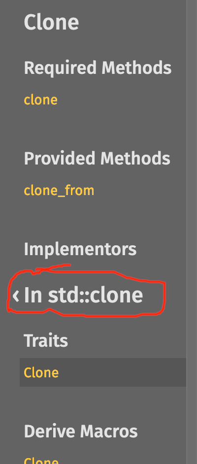 * Give readers more control of how much rustdoc shows them, and giving doc authors more control of how much it generates. Basically, https://github.com/rust-lang/rust/pull/115660 is great, let's do it too. But those are mostly orthogonal, not future possibilities unlocked by this change. |
||
|---|---|---|
| .. | ||
| src | ||
| Cargo.toml | ||
| messages.ftl | ||